Thursday, June 30, 2016

Updates and Little Villages

We have so much to tell you! The weekly newsletter will be out soon, but we can't do as many photos for it as we can here, so we wanted to do a post about happenings at Art 'n Soul, and we will do more posts like this in the future. We also do regular Facebook posts, so be sure to Like our page.

First of all, YES we ARE having Recycled Rubber on July 2nd (10:00 a.m. - 5:00 p.m.) and July 3rd (12:30 p.m. - 5:00 p.m.). We have a ton of things, so please come to see us!  WE WILL BE CLOSED ON MONDAY, JULY 4TH.

We got a Penny Black order in yesterday. Here's a picture of some things that are in. If you shop with us regularly, you know the drill...hurry in or call if you are interested in any of these items. They have a tendency to vanish very quickly! Oh, and that sailboat die? We had 4 extras, and only one left.


We got in the mini MISTIs again, and like always, they are selling very fast. If you have been wanting one, please come in or call us right away!


We also got a shipment of some RubberMoon stamps recently. Mainly we were ordering window and door stamps for the Inchie Arts class on July 9th," Little Villages", but we got in some additional stamps also, so please come and see. We are holding the window and door stamps for the class day, but Kae Pea of RubberMoon made a fabulous sample to show you what you can do with these and with Inchie Artboard squares and kits. 

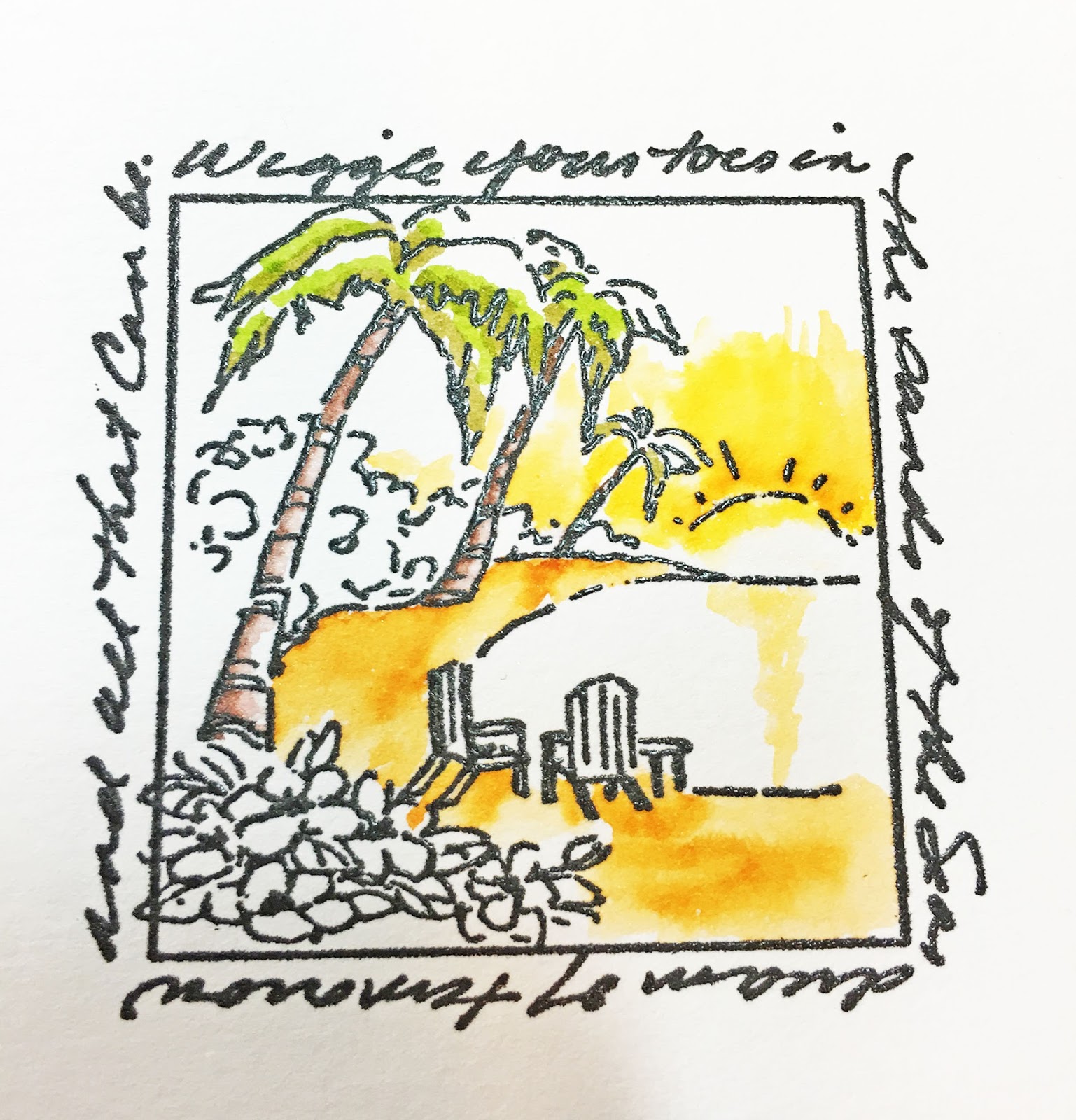
Little Village by Kae Pea

These windows and doors are so adorable!

Lisa Lee of Inchie Arts is making Artboard kits that will provide pieces to make the most amazing vignettes! These will also be available at class time. 

Even if you are not lucky enough to get a space in this class, you can still come in and purchase the stamps and kits.


Just yesterday we got Lisa's samples for the class


Just like many of the things we are going to show you in this post, these look so amazing in person!

Saturday, July 9th, 10:30 a.m. – 1:00 p.m. "LITTLE VILLAGE WORKSHOP" – Lisa Lee $35Create your own mini townscapes by stamping and coloring the latest new products from Inchie Arts. These kits include uniquely die cut pieces from Inchie Arts signature white matte board that can be colored and layered to create mini towns! There will be a trunk show of the Village kits available during the class.

We have been working hard, and finally have all of our class boards up for you to look at. If you have been thinking about signing up for one of our new classes, please come in and see the boards in person!


Today we received an order from Imagine Crafts, and we are excited to get some of their new Delicata ink pads and inkers in Celestial Copper and Black Shimmer! These are brand new, and we think you are going to love them! We also got in more stencil paste in gold, silver and copper; as well as more empty pico bottles and extra pico caps. We have restocked our white Pico embellishers as well. Hurry in, these things are already selling fast.


Last but not least, we recently had several amazing classes from Sally Penley. Sally held two incredible Introduction to Calligraphy classes, as well as a Pastel Dusting class

Sally Penley and students Pastel Dusting

Everyone was just blown away by these classes! We will be talking to Sally very soon about doing more classes this Fall. Watch our newsletter and our calendar for information. If you see classes by Sally, you should sign up right away! Her classes really filled up, and everyone who attended got so much from them.

Speaking of Sally's Calligraphy classes, she brought us some John Neal Bookseller catalogs to hand out. If you were in her class and you would like one, please come in and snag your copy!

At the top right of this post is a link to our Art 'n Soul Calendar. Please refer to it often to keep you up to date on happenings here. Once you are on the calendar, you can scroll through the months. If you click on any date/event, you can see a full description and even a photo. We try to keep the calendar updated with as much info as possible.

Please be sure to also read our newsletter! We have a new Technique of the Week each week, plus up to the minute news. If you are not subscribed, please come by and sign up, or call or email us with a request to subscribe.

Thanks so much for hanging in with us this whole way! We have some exciting things happening this summer, so please come in and see us! 


Friday, June 24, 2016

Mix up Your Matting


For this week’s technique I decided to try a different way of matting my finished product. Changing up your matting and layouts has been the subject on several blogs recently and I’ve been anxious to give it a try.

To start, I selected my stamps and a rectangular die. I used the tulip stamp from the Penny Black set, “Flower Gala” (#40-437), the sentiment “I treasure your friendship” from the Penny Black set “Special Thoughts” (#30-338) and rectangular die from the Spellbinders A2 Matting Basics A set.


To get started I cut a piece of Tim Holtz Watercolor Paper to 4” x 5 ¼”. I put it in my Mini MISTI and then centered my sentiment in the middle of the paper. Before stamping I also decided which rectangle die I was going to use to cut my design by placing it on the paper over the sentiment. After I was happy with the layout, I removed the die and then inked my sentiment with Versafine Vintage Sepia ink. I stamped the sentiment and then embossed it with Judikins Clear Detail Embossing Powder.


Next I put my tulip stamp on an acrylic block and inked it with Versafine Spanish Moss ink. 


I stamped the image repeatedly around the outside edge of the card, reinking in between each stamping. I then embossed the images with Judikins Clear Detail Embossing Powder. The Versafine ink stays wet long enough to allow you to stamp all the images and then apply your embossing powder. You could stamp a few images, heat emboss and then do more stamping, if you prefer.


I decided to “paint” my image using Distress Markers but you can also use Tombow Markers. This is very similar to the painting technique Dianne used last week which you can read about on her blog here. Like Dianne, I tested my colors on a piece of scrap watercolor paper until I found the colors I wanted. For the leaves and stems I used Twisted Citron and Mowed Lawn. For the tulips I used Carved Pumpkin, Ripe Persimmon, Candied Apple, Festive Berries, Squeezed Lemonade, Abandoned Coral and Worn Lipstick. I encourage you to try your favorite colors, especially since flowers come in every color of the rainbow.

This is one of my favorite techniques for coloring cards and when using this technique, I also like to use water mixed with Perfect Pearls, rather than regular water, for blending. It just adds a bit of extra shimmer. I just pour some from my spray bottle into a small bowl. I also have another small bowl of regular water that I use to rinse my brush.


I started with the leaves and colored them with the Twisted Citron and added a bit of Mowed Lawn for shading. I dipped a small watercolor brush into my Perfect Pearl water and blended. If the color was too light, I scribbled some color onto my craft mat, picked it up with my brush and added it to the leaf. (Note: Once you have added water to part of your image, don’t touch your marker back to that part of your paper.) I also rinsed my brush in the regular water each time before dipping it into the Perfect Pearl Water to avoid contaminating with colors. 


I worked my way around the card until all the leaves were complete. You want to color and paint one leaf at a time so the markers stay wet long enough to be blendable.


I used the same process for the tulips, using one or two colors for each blossom and then blending.


As with the leaves, I did one flower at a time so the ink from the marker still blended well.


When you hold the card panel up to the light you can see the shimmer created by the Perfect Pearl water.


When I finished the flowers, I splattered the card panel lightly with gold paint from an Art Quest palette and then set it aside to dry.


To assemble the card, I adhered a piece of So Silk Beauty Pink, cut to 4 ¼” x 5 ½” to the front of an A2 card. When my card panel was dry I centered the small rectangle die on the card panel and taped it in place before running it through my Big Shot.


I also cut a piece of fun foam with the same die. I adhered the outside portion of the card panel to the front of my card. Before adhering the border to the front of your card, make sure you have the panel right side up.


I trimmed the fun foam so it was just slightly smaller than the cut out of the card panel. I adhered that to the front of the card.


Next cut another piece of So Silk Beauty Pink so it is just a tiny bit larger than the center of your card panel. You only want to see a tiny, tiny bit of the pink. Adhere the center of the card panel to the So Silk paper and adhere that to your fun foam. To finish the card I added a few iridescent sequins. I also like to put a drop of glossy accents or a drop of Pico Shimmer in the center of my sequins.


I’ve made another version of this card without the center mat and I was surprised at what a difference adding the mat to the center of the card made to the finished look. This technique also works well with large stamps that cover the entire card panel, and dies of any shape. I hope you give it a try.


Friday, June 17, 2016

Technique of the Week: Windows to the World and Tombow Watercolors


One really fun way to color your stamping is to stamp on watercolor paper; then partially color with Tombow markers and apply a wet brush to your coloring to draw out and blend the color.


This is such a fun and simple technique, and one you may have seen before, but we wanted to show it once more.

A super fun series of stamps to use for this technique are the Art Impressions Windows to the World stamps. They are quick and easy, and really all you need to make a beautiful card.
 I chose a summer favorite called Island Window. It's an idyllic scene with palm trees, and I chose to color mine like sunset.


I stamped the image onto Tim Holtz watercolor paper with Versafine Onyx Black ink, and embossed it with JudiKins Clear Detail embossing powder. I chose the Tim Holtz paper because it is white, and I wanted the uncolored edges of the paper to match my base card.


To choose colors, I tried them out on the edge of the paper, since I was using a bigger piece that I would need for my card. When I got colors I liked, I started coloring where I wanted the colors to be darkest. 


Working in fairly small areas at a time, I colored with a marker, and then wet a brush and pulled the color out into a larger area.

If you need more color in an area that has already been colored, you can color on your craft mat with the marker and pick the color up with your brush. It's not really a good idea to touch your marker to a wet area.


I just worked around the image this way until I was happy with how it looked.


To finish my card, I die cut the image using Die-Namics MFT-600 In & Out Stitched Rounded Square die. I took a piece of Fair Blue So Silk cardstock cut to 5.25 x 4, and embossed it with a WRMK Next Level embossing folder, "Wave". I mounted the image onto the embossed panel, and adhered it to a white base card. I added a few sequins.

I really hope you give this technique a try; it's quick and such an enjoyable way to color your images. 


Friday, June 10, 2016

Playing with Yupo Paper and Alcohol Inks


This week's Technique of the week features a very fun product that is fairly new to Art ‘n Soul - Yupo paper.  Ever since Tim Holtz demo’d this wonderful paper at the CHA we have been fascinated by the properties.  

Yupo has been around for a long time but Ranger now packages 10 pieces of 5"x7" paper for $10.25 which is much more affordable than the pads of paper that sell for around $25.00.  Yupo is actually a synthetic paper made from plastic; it's very smooth and it's a great medium for  alcohol inks.  Since Yupo is made from plastic it won’t buckle when you introduce liquid like alcohol inks or watercolors.  However, since it is super smooth, it easily picks up the oils from your hands so try not to handle the paper very much.  There are a number of demos available on YouTube that demonstrate how various mediums can be used on Yupo.   


Today’s technique demonstrates the way alcohol inks react on Yupo paper when applied direct to paper.  To begin, I cut a piece of white Yupo to 4” x 5 ¼” and laid it on my Ranger craft mat.  I selected alcohol inks in Pool, Eggplant, Wild Plum, Aqua and the Pearl Fixative. 

Begin with the Pool alcohol ink and put 5-7 small drops on the Yupo in random spots.  It will immediately start spreading out to form larger circles.  The best way to do this is to just touch the tip of your ink to the paper. 


As the color drops expand, you may see the components of the color in the outer ring as the color expands creating what looks like an aura.  


Next, add a few drops of Eggplant and after that has finished expanding, add a few drops of Wild Plum. 


You can also put colors on top of each other; for example, add a drop of Wild Plum on top of the Pool and watch how the colors expand and blend. 


The alcohol dries quickly but can be reactivated by adding more alcohol ink or small drops of alcohol ink blending solution onto the Yupo. 


This is a close up of a section of the paper as the colors
 expand and blend 

While I was dropping colors onto my Yupo, my two kitties came running through the room and startled me.  The result was a lot more ink on my paper than I planned.   Fortunately. Yupo is very, very forgiving and you can continue adding layers of color and Mixatives either with or without the blending solution, until you get the look you want.

Here's the "oops" part of my project where I ended up
with lots more ink on my Yupo than I planned thanks to
my two playful kitties!

I had a few white spaces left on the paper so I put some aqua alcohol ink on a felt blending pad and pounced it all over the paper.  This also blended the darker colors a bit.  I added more aqua ink to the felt pad as needed.  Next I put drops of the Pearl Mixative on the felt pad along with a small drop of blending solution and pounced all over the paper.  I added more Pearl Mixative and blending solution as needed until I was happy with the results. 


I decided to use this piece as a background for my card.  


Last Christmas I bought the Poppy Massa Leaf Frame (#1021) for my Christmas cards and I've been looking for another opportunity to use it.  I die cut it out of my favorite color of So Silk - Glamour Green. 


 Next I stamped the Memory Box sentiment "Happiest" (C2078C) with VersaMark on white cardstock that was cut to 1 7/8" square.  I embossed it with Ranger Black Sparkle embossing powder and shaded the outer edges lightly using a sponge blender and Distress Mermaid Lagoon ink. 

I cut another piece of So Silk Glamour Green to 4” x 5 ¼” and adhered it to the front of an A2 card.  I trimmed the Yupo paper to 3 ¾” x 5” and adhered that to the front of the A2 card.  Next I adhered the Massa Leaf die cut to the front of the card.  I cut a piece of fun foam slightly smaller than the square sentiment; adhered it to the back of the sentiment and then adhered it to the square opening of the die cut.  I added a few iridescent sequins using Ranger Matte Adhesive. 


Yupo also die cuts beautifully.  This Yupo paper was colored with alcohol inks in red, yellow and oranges.  Gold Mixative was pounced all over the paper and then it was die cut with the Penny Black Medallion Die (51-211.)  


The colors of the alcohol ink stay very clear and vibrant on the Yupo.  


These are examples of alcohol ink applied directly to Yupo without any additional Mixatives or blending solution added.  Don't these designs just beg to be Zentangled?


I really hope you will try this technique.  I have to warn you though, this technique can be addictive!   My project didn't go the way I expected but I was still happy with the final results.  We'd love to see your creations!

Thursday, June 9, 2016

Beautiful Zentangle Inspired Art


This is just a quick post to tell you about our customer Chawn Vance came in and showed us this beautiful gourd that she had Zentangled. We were really blown away, and she agreed to let us post her work. We posted it on our Facebook page too, and many of you were also blown away by how beautiful her work is. We're so proud, because she said that we turned her on to Zentangle in the beginning!

ZIA by Chawn Vance

Shawn said she uses Distress markers to color the gourds she makes, and the White Uniball broad gel pens that we sell at Art 'n Soul for the dots. She uses a fine Sharpie pen for her Zentangling.


ZIA by Chawn Vance

ZIA by Chawn Vance

ZIA by Chawn Vance


Shawn does sell her beautiful artwork and you can contact her at chawnvance@yahoo.com.

Friday, June 3, 2016

Technique of the Week: Make a Splash!

In conjunction with the Art 'n Soul weekly newsletter, here is the new Technique of the Week.


Splash Ink is a product that I have been meaning to get back to. They are so fun to play with, and give such beautiful results.


Splash Inks are made of pigments suspended in a fine acrylic emulsion. They are compatible with all waterbased mediums and paints and can be used for watercolor techniques on most porous surfaces. We carry sets of these at Art 'n Soul, and they come in 4 basic colors: magenta, yellow, blue & black. Hundreds of different hues can be mixed using these 4 colors. The recipe card that comes with the set has instructions for mixing 100 colors.

Lisa Lee of Inchie Arts came and did a class for us, where we sprayed Art Squares with water, and then just dropped color directly from the Splash Ink bottles onto the wet Art Squares. After setting them aside and leaving them to dry, we had amazing little works of art that, when attached to a base card with a sentiment stamped, made gorgeous and quick cards for any occasion.

Here are the cards I made

Magenta stamps: I.0406 Fresh Bouquet in Square; 
07.670.H I love the way our lives are interwoven

Magenta stamps: G.0432 Fish; 07.734.F See the World

Magenta Stamps: 09.163.H Flower; 07.954.G Think about you often

Magenta stamps: 23.249.J Framed Daisies; 
07.525.F You are the Sunshine

I chose 4 Magenta stamps, which are older images that I found in my stash. I wanted stamps that had a good amount of open area in them, and would also fit onto a 2" Art Square.

I chose white 2" Art Squares (Twinchies), stamped each one with a Magenta image in Versamark ink, and embossed each with JudiKins Opaque White embossing powder.

One by one, I sprayed each square with pearly water (1/4 tsp Perfect Pearls powder in 2 oz water). I then dropped drops of Splash Ink onto the wet image, and left it to dry overnight. When I first dropped the ink, it completely obscured the image, and I wondered if my experiment was going to work.

After absorbing into the Art Square, the embossed image did resist most of the ink. 

I used a damp baby wipe to wipe a little of the color off the embossing, but not all. I like the way the colors have a watercolor look; unpredictable but beautiful.

To finish each card, I got a strip of cardstock that would coordinate with the Splash colors used. Each strip was embossed with a different embossing folder, and adhered to the base card. The finished Art Squares were mounted to each card with a piece of slightly smaller white fun foam underneath, thereby popping up the square. I then chose Magenta sentiments to stamp beneath the panels on each card.

I hope you try this technique. It was very easy and a lot of fun. Art 'n Soul does carry sets of Splash Inks. The colors can be mixed and also used for painting. They are intense and beautiful.

For more photos of this process and a complete list of the materials used, please visit my blog post here.

One last note:
We still have mini MISTIs in stock! We also have some standard size MISTIs on the way to us. If you want a standard one, please do a paid order. 8 of the 12 MISTIs that are on the way are already sold.