Friday, May 20, 2016

Technique of the Week: Shine, Shine, Shine


This week’s technique features Wink of Stella brush pens on vellum paper.  You will be amazed at the shine you get when you use these pens on vellum.  I saw this technique on Jennifer McGuire’s blog and I couldn’t wait to try it.


To get started I cut a piece of 36# vellum to 4.25” x 5.5”. Because I planned to emboss my stamped image I used a powder tool over the surface of the paper. I put the paper in my MISTI and positioned the Magenta Azalea stamp (14.651.Q) from their Spring/Summer collection on my vellum paper. I picked it up with the cover of the MISTI and then inked it with Hero Arts Unicorn White Pigment Ink. Next I applied Judikin’s White Opaque Embossing powder over the stamped image.

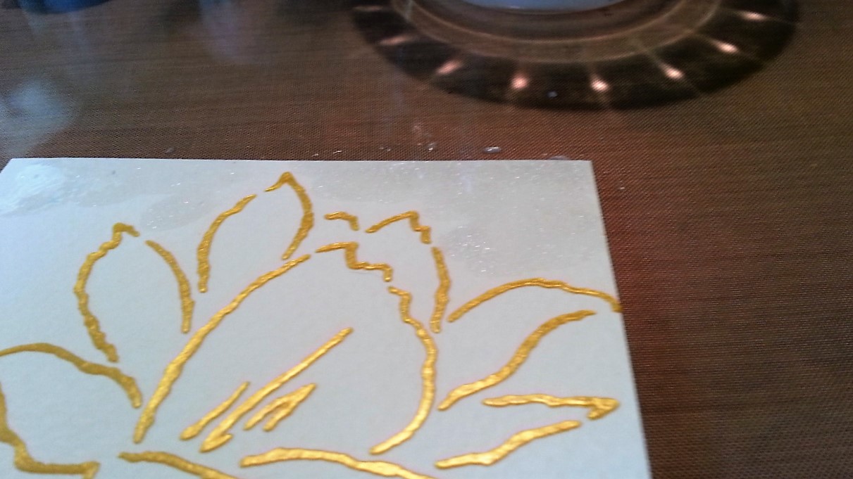
When heating the embossing powder on vellum paper you need to be careful so that you don’t warp or melt your paper (speaking from experience unfortunately!) Before you direct your heat gun to your paper, let it run for about 30 seconds or so to be sure it is up to temperature. Keep the heat gun moving over the surface of your vellum. You can also heat it from the back of the paper, just be sure to keep the heat gun moving. It takes a bit longer to emboss on vellum but for your patience you’ll be rewarded with a beautifully embossed image. The embossing powder will act as a ridge to help remain within lines when you are painting.


I put the image on my craft sheet and collected my Wink of Stella pens. The Wink of Stella brush pens come in 15 colors, plus clear. I only have four pens – clear, dark pink, green and yellow, but after doing this technique I certainly plan to buy more!


Before I started I used a scrap piece of vellum to try some blending. I originally planned to blend some of the yellow with the green to create a yellow-green color for the leaves and blend some of the yellow with the dark pink to create a shade of orange for the center of the flowers. I ultimately decided to keep it simple and just use green, dark pink and clear for this image. 


I started with the leaves on the azalea image using my green pen. I started at the base and painted about half way down the leaf. Then I used my clear pen to blend the color to the tip of the leaf. I continued with all of the leaves in this manner. The Wink of Stella stays wet for a bit longer on vellum than it does on regular paper so you can blot up excess color with a paper towel, add more color or do more blending.


Once I finished the leaves, I started on the flower. I followed the same technique as with the leaves. I applied dark pink to the center and then used clear to blend the color out to the tips of each petal.  


To finish the card I adhered a piece of So Silk Beauty Pink (cut to 4.25” x 5.5”) to the front of an A2 card. Since I planned to add the frame you see in the photo. I applied 1/8” Scor Tape to the back of the vellum and then attached it to the front of the card. (As you can see from the photo, regular adhesive shows through vellum so if I hadn’t planned to add the frame I would have used Vellum adhesive to attach the image to the card.)


I cut a piece of textured white cardstock to 4.25” x 5.5” and then used Spellbinders A2 Matting Basics B (the 3 3/8” x 4 5/8” die) to cut a frame. To give the frame some dimension, I adhered foam tape to the back of the frame. I just cut the foam strips in half lengthwise as shown, removed the backing paper and adhered to the frame to the front of the card. I added a few iridescent sequins using Ranger Matte adhesive. I also like to use the Pico Shimmer embellisher to add an additional drop of shine on my sequins. I set the card aside to let it the sequins and Pico dry overnight.

Once I decided on the colors I was going to use for the image, this card came together very quickly so I hope you will give it a try. I encourage you to try blending the colors you have because these pens blend beautifully. This is another good technique where you can stamp several images at one time to have them available when you have a few minutes to paint. The photos don't fully capture the shimmer so please stop by Art 'n Soul to see this card in person. 

Friday, May 13, 2016

Technique of the Week: A New Use for Embossing Paste


This week’s technique uses embossing paste to accentuate and add dimension to watercolor painting. 


To create this card select a stencil that creates an outline.  The example uses Magenta Artist’s Flower, TM120.  Unfortunately, this stencil has been discontinued but we still have a few in the store.  Other Magenta stencils that would work well include Stylized Leaves (TM141); Bird (TM155); Dogwood (TM149) and Sunflower (TM148.)


Begin by placing a 4.25” x 5.5” piece of Tim Holtz Watercolor paper on your craft mat.  Place the stencil over the craft mat and tape it down so the stencil doesn’t move around when you are applying the embossing paste.  In my example I used Gold Metallic Imagine Craft Creative Medium Embossing Paste but Dreamweaver Embossing paste will also work. 


Use a palette knife to evenly apply the paste across the entire stencil.  Hold the knife at a 45 degree angle to the stencil as you apply the paste.  You can scrape off the excess and return it to the jar.  Remove the tape from the bottom and sides of the stencil, leaving the tape in place on the top. 


Lift the stencil (the top piece of tape will act like a hinge and allow you to lift the stencil evenly from your work.)  Remove the stencil and set your piece aside to dry for approximately an hour, depending on the thickness of the paste.  Immediately wash the stencil and palette knife with warm water to remove the paste from your tools. 


After the paste is completely dry you can begin painting.  You will need small watercolor brushes, water mixed with Perfect Pearls powder (1/4 tsp to 2 oz. of water) in a small bowl or cup, regular water in a small bowl or cup, and Nuance.  I painted the background first using Nuance colors of turquoise, cerulean blue and mauve; the leaves were done with grass green and jade; the flower was done with scarlet, hot pink and red.  Sprinkle a bit of each color into a palette but DO NOT add water to the colors.  You also need a cloth or paper towel to wipe your brush on as you paint.


Begin by using a paint brush to apply the Perfect Pearls water to a section of the background. 
  

Pick up a bit of the dry turquoise powder with your paint brush and dab it on the wet watercolor paper.  Keep adding more color and blend it over the wet area using dabbing motions.  To add another color, rinse your brush in the regular water, dry the brush on the towel, and then dip it lightly in the Perfect Pearls water.  Pick up a bit of the cerulean blue or mauve and apply it to the same section of the background and blend it with the turquoise using a dabbing motion. 
  

 As you finish one area, use your clean brush to apply more Perfect Pearls water in another section of the background.  Then apply more color and blend until you get the result you want.  If the colors are too dark, you can also dab the color off with a paper towel.  If the color flows into the leaf or flower, you can also dab it off with a paper towel.  When the background is complete, use a heat gun to dry it (or let it air dry.)
 

When the background is dry, use the same process to paint the leaf and stem with the greens.  Use less Perfect Pearls water on the leaves to prevent the color from flowing onto the background.  You can always add more water as needed.  Don’t blend the colors completely – you want to have shading on the leaves by leaving part of them lighter as if the sun was shining on them. 


When the leaves are dry, paint the flower with the shades of red, again leaving part of the petals lighter by blending out the color as if the sun was shining on the flower.
 

When the flower is dry, use an embossing powder tool on the lower right corner of the panel then stamp the Magenta sentiment “Think about you often, care about you always” (07.954.G) with VersaFine Vintage Sepia.  Emboss with JudiKins Clear Detail embossing powder.  The panel was then cut to 4”x 5.25”, adhered to a panel of Beauty Pink So Silk and then adhered to a panel of gold cardstock and finally adhered to an A2 card.


You can see the finished card at the store, as well as the card shown above, created with the Magenta Leaf stencil (TM141).  Magenta has other stencils such as a bird (TM155), Dogwood (TM 149) and Sunflower (TM148) would also work well with this technique.  The painting process goes more quickly than it sounds, provides a great finished product, and is really fun to do.  Paste several at a time, and you will have them to color when you wish. Using Perfect Pearls water, rather than regular water with the painting, adds a lovely shimmer to the card too.  I hope you will give it a try. 

Friday, May 6, 2016

Technique of the Week: Perfect Shine

One of the gems in our weekly newsletter is the Technique of the Week article. This week, Dianne tells you how to get shine in your stamping with Perfect Pearls powder. Here's her card:


Dianne used the Magenta stamp Flower Trio 14.641.M, and the Magenta sentiment Life is Beautiful 07.940.G. 

If you do not receive our newsletter, you can view the Newsletter archives by clicking on the link to the right of this post at the top. If you want to get our Newsletter in your inbox each week, please come by the shop and sign up, or email us and ask to be added. You will be glad you did.

This week in the newsletter we are announcing exciting new classes from Prismacolor artist Terry Medaris and local artist Sally Penley. There is a link to the right of this post at the top for the Art 'n Soul calendar, which will have all of our classes listed. You can come by to sign up, or call us and sign up over the phone with your credit card.

We hope to see you soon!

To view additional photos and a step by step how to for our technique of the week, please visit Dianne's blog "Backporch" by clicking here.

Friday, April 29, 2016

Technique of the Week: White Pencil Shading

Love this technique that I found at Jennifer McGuire's blog. This is a super simple technique that you can do by stamping with white pigment ink (I used Hero Arts White Unicorn ink, and we have this in stock at Art 'n Soul, with more on the way!). You also need a white Prismacolor pencil, and we have these in stock too.


This works best with dark cardstock, but you could use a dark pink and make a nice Mother's Day card. It could also be used for a Birthday, or just "Thinking of You."

For this card I used one of the new Magenta collection stamps Iceland Poppy 14.650.P, and the sentiment is also from Magenta, With Sympathy 07.928.I.

Full instructions for this card, and a few more photos can be found in our weekly newsletter, and also at Dianne's blog "Backporch". You can link to the post here.

If you don't get our weekly newsletter, you can sign up at the shop. If you are not local and wish to get it, you can email us your name and ask to be added to the mailing list. We try to do a new Technique of the Week each week, and we put in lots of other things, such as happenings in the store, and also classes. We won't spam you! We send out our email newsletter each Friday.

You can link to our archived newsletters at the right top of this post, and you can also link to our store calendar and other information.

Come in and see us, we have just gotten in lots of things from Memory Box, Penny Black and Magenta. You know how fast these things go out, so hurry in! All of the new Magenta Nuance colors sold out on the first day. We still have the sets of 15 colors, and you can be sure to get the 5 new colors by ordering them on a paid pink sheet. This is the best way to ensure you get them with the next shipment, which will be soon.

Oh! and Pam opened up a couple of spots in her Nuance'd Die Cuts class, both for this Saturday the 30th and for Wednesday evening, May 4th. Call or come in to sign up, you will be glad you did! You do not have to already own Nuance to take this class, so if you have been wanting to try it out, this is your chance! Here's an example of a card you will make in this class.


Using Nuance, a Magenta stamp and Memory Box die...we think it's stunning! 


Friday, April 15, 2016

Technique of the Week: Artsy Accidents by Marj Marion

Don’t you love it when you create something artsy entirely by accident?  I love to do die cut piecing, and often paint my die cuts with a paint brush using Nuance “watercolor” ink, mixed with “pearly water”. I create a palette of Nuance colors, and paint up my die cuts for piecing back into a card later.

This photo shows how I paint the die cuts on top of a waxed sheet.
Save the die cuts for another project. I used Distress inks
(reds, yellows and oranges) and pearly water.

 In other posts, or in my classes, you know how often I use the Waxed sheets (also called Kabnet, and found at Costco).  When I’m making a painty mess, sometimes I work on a waxed sheet so I don’t have to clean up my craft sheet.

During a recent die cut painting session, instead of tossing the waxed sheet in the trash, I laid it out to dry, and later, I liked the look of it.  So……I applied Glue stick to a 65# white paper, crinkled up the waxed sheet  and then smoothed it out over the glued surface. I let the glue dry well, then trimmed it up as a top panel on my finished card.  I love the way the Perfect Pearl sort of outlines the drips and droplets that dried on the waxed sheet. 

After the waxed sheet is dry, I crinkle it up, then smooth out 
and glue to a piece of card stock.  I run a brayer over it to keep 
some of the wrinkles, but make it smooth enough to stamp on.

You can change the look of your background by changing
up the color of the card stock you glue the waxed sheet to.

I used Magenta 07.805 I  and Tim Holtz Scribbles and Splats
(Alterations) die 660222 to finish this card.


I used Magenta 37.286 J and Impression Obsession D 17078 Inspire,
along with some washi tape to create this card.

 I added some artsy themed stamping to compete my card.  Try making some happy accidents with your art supplies, and give this technique a try!!

By the way everyone! There are 5 NEW colors of Nuance coming out, and they are being shipped to us next week! If you love Nuance, then you should definitely think about adding to your colors. Order yours on a paid pink sheet no later than Monday, April 18 to get your new colors in the first shipment!


Thursday, April 7, 2016

Technique of the Week: Yupo, Alcohol Inks and Earth Arts


This week’s Technique of the Week features one of my favorite products from this year’s CHA – Yupo paper. Yupo has been around for a long time but Ranger now packages 10 pieces of 5”x7” sheets for $10.25 which is much more affordable than the pads of paper that sell for about $25. Yupo is actually a synthetic paper made from plastic; it’s very smooth, and it’s a great medium for watercolor. In the Tim Holtz video here you will see how great Yupo works with alcohol inks as well. They also blend beautifully WITHOUT the blending solution.  


Inspired by the video and wanting to create a card with another fabulous Earth Arts stamp, I decided to try out the alcohol inks and Yupo paper. For this card I used blue shades of Stream, Pool and Cloudy Blue alcohol inks, Pearl Mixative, Yupo Paper, Earth Arts Crane stamp, Black Archival Ink, We R Memory Keepers Woven Embossing Folder and So Silk Black paper, an alcohol ink applicator and felt blending pad and a piece of fun foam.


Cut the 5”x7” Yupo paper in half so that it measures 3 ½”x5” and lay it on the craft sheet. One of the nice features of Yupo paper is that it stays flat and doesn’t warp. Attach the felt blending pad to the alcohol ink applicator.  Put one generous drop (about the size of the top of a pencil eraser) of each blue ink on the applicator pad. Note, you do not need to use blending solution for this technique.


Begin pouncing the color all over your piece of Yupo paper. I started in one corner and worked my way over the entire piece. If your applicator pads starts running out of ink, just add a bit more of each color to the pad and continue pouncing it on your paper. Continue applying ink until you are satisfied with the color. You will notice that the ink dries quickly but additional ink can be layered on top and both layers will blend together automatically.


Next I used the MISTI to stamp the Earth Arts Crane stamp. I’ll just have to say another great thing about the MISTI. Using my MISTI I stamped the crane and the first time I didn’t get enough ink on the center design of the stamp. I simply reinked the stamp and stamped again. The re-stamping produced a very dark, crisp image. If you haven’t seen this tool at work, please stop in the store for a demo.


I stamped the crane again on a piece of masking paper, cut it out and then put the mask over the stamped image on the Yupo paper. 


I added several small drops of Pearl Mixative to my felt applicator (the same one that I used to apply the color) and a small drop of each of the blue alcohol inks. I pounced the color all over the piece, stopping when I was happy with the appearance. 


The mask protected the stamped image. As you are working, you can add additional Pearl Mixative to your applicator, just be sure to use small drops so you don’t end up with large spots of the mixative on your card. 


To assemble the card, I cut a piece of silver metallic cardstock to 4”x5¼” and attached it to an A2 size white card. I cut a piece of black So Silk slightly larger than the Yupo paper and embossed it using the "Woven" We R Memory Keeper Next Level Embossing Folder. I applied adhesive to the back and attached it to the silver paper. I cut a piece of Fun Foam slightly smaller than the piece of Yupo and attached it to the back of the finished image. I attached the image to the black So Silk.

Although there are several steps to this technique, it was actually quick and easy. Yupo paper comes in both white and translucent and we’ll be experimenting with it more in the coming weeks. Stay posted for more technique ideas. Please share your experiments with us, too!

Friday, April 1, 2016

Technique of the Week: Combining Earth Arts Stamps with Nuance and Distress Inks

Technique of the Week is posted in conjunction with the Art 'n Soul weekly newsletter, and this week's technique is by Marj Marion. Marj has kindly agreed to tell us how she made these gorgeous cards, just using some Earth Art stamps and some background panels she just had lying around.


Maybe like me, you enjoy making several Nuance background panels or Distress Ink panels at a time, and having them handy for future stamping projects. I keep a stash of these panels handy, and find it easy to then add stamping or other techniques when I’m ready to make cards.  I recently made a number of cards using Earth Art stamps, and panels that I had previously made.

Earth Art Roadrunner card by Marj Marion

For the Roadrunner card shown above, I choose a sort of mottled, Nuance background panel. I created a few colors of Nuance colored water on a palate. With a 3/4” watercolor brush, I painted horizontal streaks at the bottom of the panel to create sort of a “road” for the Roadrunner to run on!  Then, I did partial stamping in black Versafine ink with Stampscapes 286 E background stamp, making the sketchy lines along the “road”.  Then I stamped the Earth Art Roadrunner stamp in black Versafine ink as well. I think this roadrunner is so adorable, and I can think of several quotes that would be fun with it…….”The first step is always the hardest!”, or “I just want to run to your house and play”, or "Can I run over and help you?"

Earth Art Tree of Life card by Marj Marion

For the Tree of Life card, I chose a Nuance panel that had some pale blue and green shades of Nuance in the upper sky area, and more autumn shades in the ground area.  I made some colored water with Distress reinkers in a palate and painted some swooshes in the lower ground area.  I stamped the Earth Art Tree of Life image in Black Versafine ink. I layered the colored panel on a black panel, off-setting it to the right.  I wrapped some multi-colored narrow green ribbon around the black panel on the left, and glued a leaf-shaped wooden embellishment on top of the ribbon. Then, I adhered the entire panel to a folded green card. This Tree of Life image would be good for any friend in any "stage of life". 


Earth Art Bee card by Marj Marion

For the Bee card, I dug deep in my stash for this unusual panel!  :)  I had experimented with watercolor techniques on Yupo paper (a smooth, somewhat shiny paper), but didn’t finish a card with it.  As I looked for a panel to use with Earth Art images, I choose this one for the Bee image.  I had painted swirls or splotches of red, yellow and orange watercolor paint on the Yupo paper.  After it was dry, I stamped this lively Bee image from Earth Art, using black Brilliance ink, as it dries well on glossy surfaces. After the ink was dry, I used scissors to cut wavy edges on the panel. Then, I layered it to a black panel, and cut wavy edges here as well.  Next, I layered it to a red panel, and then to a yellow folded card. The lively colors suggest a message like “Bee kind to yourself!”, or “Bee sure to make some art today!"


Earth Art Elephant card by Marj Marion

Who doesn’t love gentle elelphants?  I made this elephant card using the Spellbinders A-7 Modern Stationery die set S-6013.  It contains 7 dies, and you can make small, medium or large cards. I cut a white panel, and stamped it with Impression Obsession Clouds Cover A Card CC091 using Tumbled Glass Distress Ink.  I stamped the Earth Art Elephant stamp with black Versafine ink, and then layered this to a black folded card which was also cut with the Modern Stationery Die Set. I added three black bling dots at both the upper left and lower right corners. Inside the black card, I glued it a text weight panel of white paper so I could write with a normal pen.


Earth Art Lovebirds card by Marj Marion


For the last card in this series, I felt that sometimes simplicity is the best choice. I cut a circle in a black panel to accommodate the Earth Art image “Love Birds”.  I stamped the image with black ink on a cream panel, then centered the opening of the black panel over the image and adhered in place.  I layered this onto a dark red folded card. I added the word Soar, from Impression Obsession C 13041, layering with foam tape for dimension.  Last, I added four dots of black Pearl Pen in the corners of the Soar tag.

Look through your stash of prepared background panels when it’s time to do your next card!

Come in to Art 'n Soul and check out all of these samples in person; and be sure to come to Gwen Evans’ demo of Earth Art stamps on April 9th from 11-3.